Ever curious how a character in Ojolie ecards comes to life – from storyboard to digital canvas?
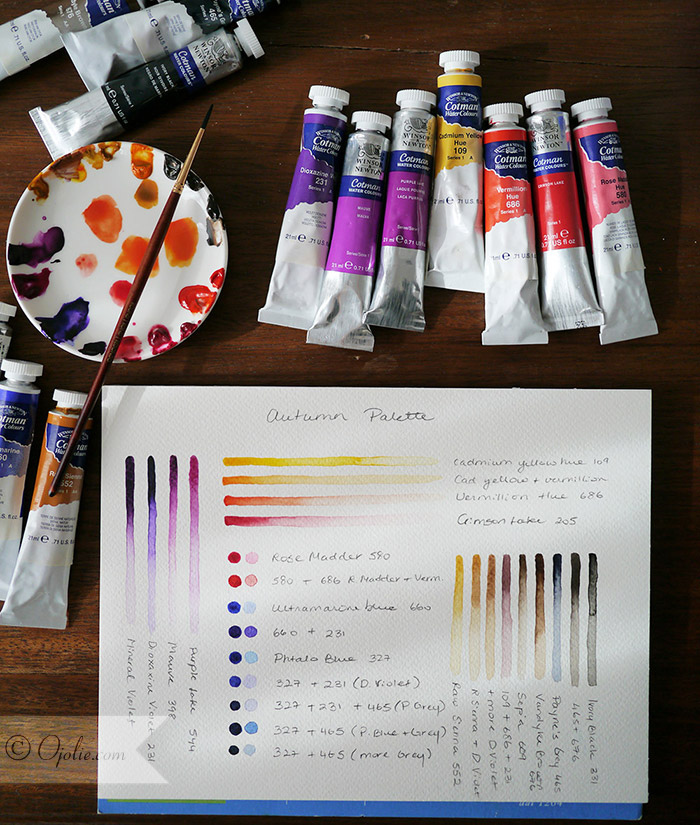
A very important step that might not seem immediately obvious is actually developing a palette for the card. This is not something I have always done, but with time I have found that this makes the process of developing a cohesive looking card much easier. Plus its actually quite relaxing and fun, not to mention a great way to remember how you mixed a certain favorite color.
 |
| A bright watercolor palette for Autumn |
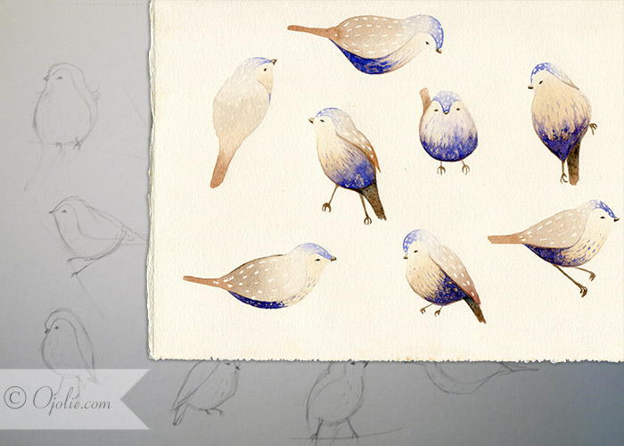
The characters are developed via a set of quick sketches, which allows you to rework them until they are just right. For this card, somewhat unusual, the characters just seemed to flow pretty clearly onto the paper and Even though I only needed a few birds, I had to paint them in a variety of poses to be able to bring them to life as animations. This was the most difficult part and adding a design and details doesn’t make it any easier … but then the characters insisted this was how it had to be.
 |
| Character Sketches and illustrations of the little birds |
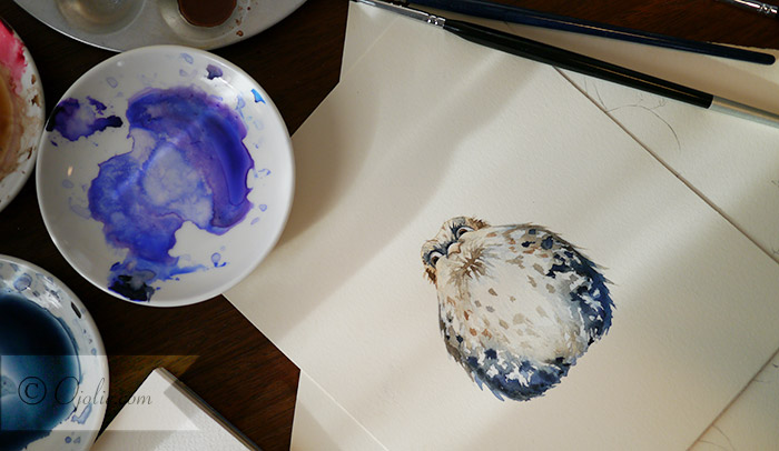
For the little owl, layering was as always my friend, starting with the lighter colors and gradually building up the details and dark shades in the feathers. For all our feathered friends, having a clear palette and sticking to a mix of a few complimentary colors really makes it much easier to get a nice pleasant looking character, even when the coloring of the feathers is a figment of your imagination.
 |
| Fluffy little owl |
After scanning the paintings and cleaning up the backgrounds on the computer, there are a few other little secrets to bringing them alive, but maybe I will share that another time.
